Building a design system from the ground up at Edda
Why we needed a design system
When I joined Edda as a designer, I quickly noticed we had a very loose system that was leading to a lot of inconsistencies in our apps. Designers were creating similar components from scratch for every project, engineers were writing duplicate CSS, and our product was starting to feel disjointed across different features. I saw the opportunity to build something better. We needed a design system that would:


I pitched the idea to leadership, got buy-in, and started working on it.

1. Audit
I started by doing a full audit of our web apps to understand what we had. I went through colours, lots of screens, cataloging components, patterns, and styles. I captured atoms and molecules—buttons, inputs, typography, spacing, colors—and identified which components were actually being used and which ones could be deprecated.
(Image of video of the audits here)

2. Base styles definition and primitive layer tokenization
Once I had observed and documented the foundations of our web apps design, I made a comparison with our branding elements to decide which ones to keep and which ones to remove.
At the end of the day, design systems are just branding, right?!
I then proceeded to create a tokenization system for our most foundational elements: colors, spacing and fonts. At this stage only our Primitive tokens were created in Figma, as seen below.
I also ran accessibility tests to work out what colour combinations between background colours and font colours would work in order for our web apps to be accessible. For added complexity, I needed to consider the different states that UI elements can have: disabled, rest, errors and more. To do this, I made use of the Contrast Figma plugin where I measured each of the different samples.
This first layer of tokenization was essential groundwork to then lay down the second and most important layer: the semantic layer.
Base colors
Extended colors
Accessibility tests using the Contrast plugin

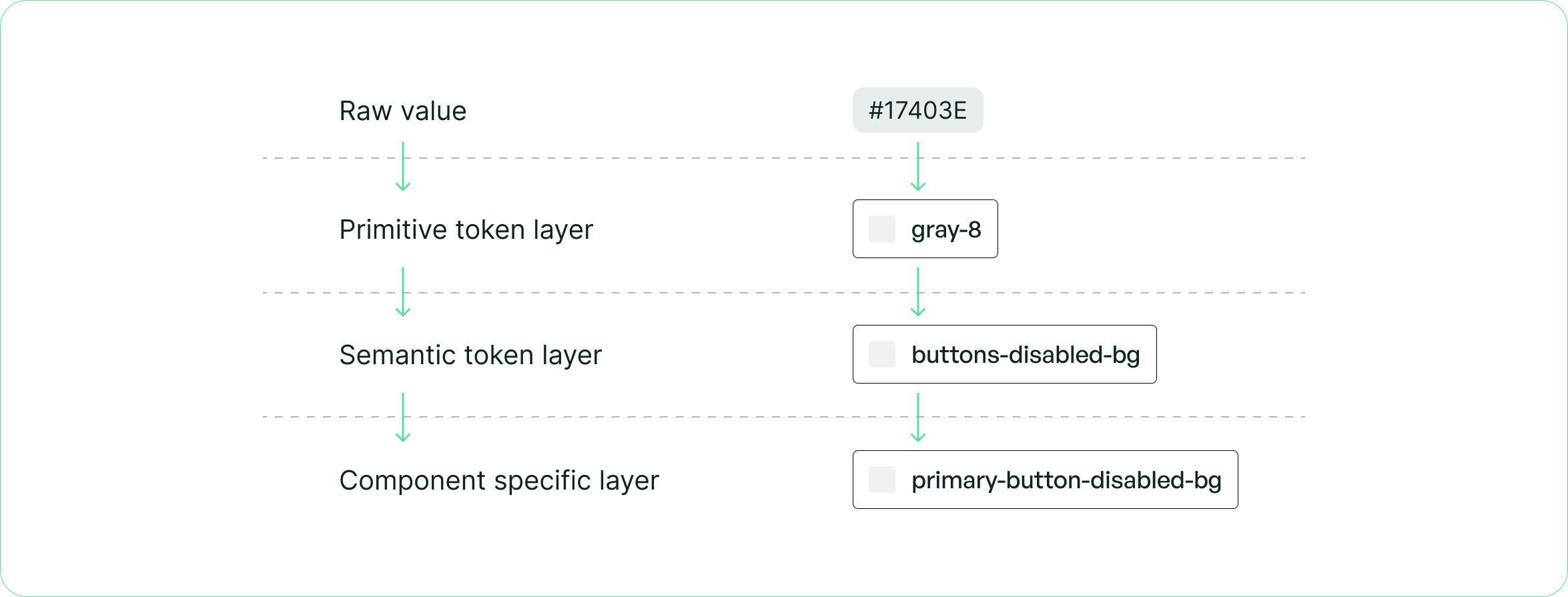
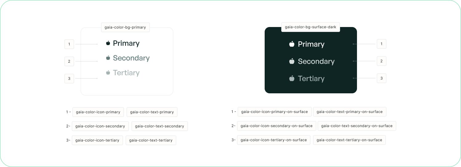
3. Semantic layer tokenization
With the primitive tokens and accessibility tests in place, I moved on to creating the semantic layer — the layer that gives meaning to our tokens.
Instead of using emerald-100 directly, designers and engineers would now use tokens like color-background-primary or color-text-error. This abstraction meant that:
- Tokens communicate intent, not just values
- We could swap out entire colour themes without touching component code
- New team members could understand the system faster
This was the most complex part of the process, but also the most valuable. The semantic layer is what turns a collection of styles into an actual system.
Semantic layer tokenization within the Figma variables window

4. Rebuilding components in Figma
I re-created Figma components using tokens I just created and common patterns. Every component was built with variants, proper auto-layout using spacing tokens, and clear naming conventions. I made sure components were flexible enough to handle different use cases but opinionated enough to maintain consistency.
Component in our design system with properties and tokens applied

5. Documenting our tokens, design decisions and components
I then proceeded to document the token hierarchy and categorization I had created for the whole team to read and reference.
The components documentation took slightly longer, since I had to go through each variation in the webapp to document the correct usage of it.

6. Training and governance
I pushed the system live, trained the designers on how to use it, and created a governance process for it. We established:
- Design system sessions where designers could ask questions or propose changes to our components
- A contribution process for proposing new components
The goal was to make sure everyone knew how to use the system and felt ownership over it.

7. Implementation with engineering
I worked closely with the dev team to implement the tokenization system in code. We aligned on CSS variables and design system tokens, making sure that what designers saw in Figma matched what engineers built in React.
I also supervised the creation of new components, reviewing both design and code to make sure everything met our standards. It was a lot of back-and-forth at first, but once we got into a rhythm it became much smoother.

8. Optimized handoff
Finally, I optimized our design handoff processes. Before, designers were either creating long documentation explaining their designs to engineers, or sometimes nothing at all! Now, with the design system in place, handoff became much simpler:
- Designers link to components in the design system
- Engineers know exactly which React component to use
- Fewer questions, fewer meetings, faster shipping
This also meant that if we ever needed to change our primary color, we could update one token instead of hunting through dozens of files.
9. Next steps
The next phase for GAÏA is documenting everything in Storybook. This will give engineers a living, interactive reference for all our components — with code examples, props documentation, and visual states all in one place.
We're also building a website to have components documentation available for the team to look at, including do's and don'ts for each component to ensure consistent usage across the product.
Results
The design system has been a huge success:
- Design time reduced, since Designers can now build screens in hours instead of days
- Development time reduced - Engineers spend less time styling and more time on logic
- Consistency across the product - Our web apps now feel cohesive and professional
Thanks for reading!
 Back to top